
One aspect I like to use for my magazine cover is how the photo overlays the masthead allowing it to stand out therefore drawing the attention to the audience.
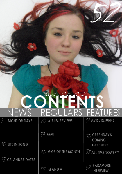
Refering to my draft, I used my own images to construct my magazine as a first plan. The aspects I perticularly like is the use of large numbers and a large contents heading.

Experementing with different fonts, I decided to give the large page number a rather fancy type font, inspired by Q magazine.
The 'colour burn' effect on the text I liked but the clarity is poor so this effect might be used somewhere else.

By using a paint brush, I produced some effects on the text to enhance the rock and powerful side of the magazine. It also makes the contents more interesting and appealing with these suttle changes.
No comments:
Post a Comment